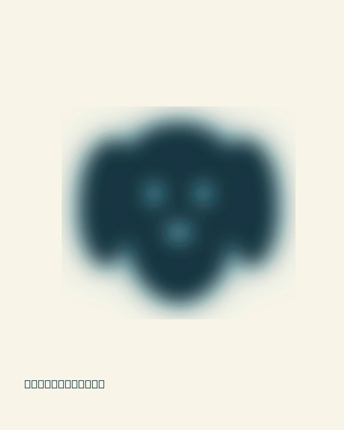
Fine stable grain gives the diffuse colour a printed feeling. The type stays sharp, so the composition has somewhere to rest.
silhouette + core + halo + grain
THE IDEA / LET THE EDGES BECOME ATMOSPHERE
A little less certain. A little more felt.
A diffuse image lets colour cross the edge of a form. The subject is still there, but its boundary becomes a transition. A quiet background and fine grain make that transition feel physical.
Explore the layers separately, then combine them. This original browser study uses procedural masks and Canvas blur, colour fields and noise. Every control changes the finished poster.
01 / START WITH SOMETHING RECOGNISABLE
A silhouette gives softness a subject.
Begin with a simple shape on a pale background. A dog needs floppy ears, two openings for eyes and a soft triangular nose; a flower needs a rhythm of petals. The image can lose detail and still read, because its overall silhouette carries the idea.
In this study, a small offscreen mask holds the shape. Filled pixels keep colour; empty pixels reveal the paper. The mask is original vector geometry, so you can explore the effect without needing an image upload.
mask coverage → where colour is allowed to appear
Try: Choose Shape and compare the dog, flower and orb. In Silhouette, inspect which features make each one recognisable.
02 / LET THE COLOUR CROSS THE EDGE
A softened core. A wider halo.
A single strong blur can flatten the image into an indistinct patch. Instead, use two versions: a core with a smaller blur and a halo with a wider blur. The core keeps the subject; the halo lets its colour reach the surrounding paper.
Increase Diffusion gradually. The tiny openings soften before the larger outline disappears. Core strength adjusts the dark layer’s opacity, giving you another way to preserve identity without making every edge sharp.
diffuse image = softened core + wider colour halo
Try: Choose Diffusion. Bring the slider down to zero, then raise it slowly. Find the point where the eyes or flower centre are barely readable.
03 / GIVE THE COLOUR SOME SPACE
Let the background participate.
Place a broad, quiet colour field near the silhouette. A second displaced halo adds asymmetry: colour can drift farther below or beside the subject rather than spreading equally everywhere. Pale paper shows the transition instead of competing with it.
Palette changes the paper, core, halo and field together. Blue ink feels cool and dense; coral lets a flower feel warm and luminous. Iris and moss give the same geometry a different atmosphere. Compare colours with the shape and diffusion held still.
colour field + displaced halo → a surrounding atmosphere
Try: Choose Colour. Compare the palettes and move Colour spread. Keep enough empty paper that the colour has a visible place to fade.
04 / ADD TEXTURE AFTER THE SOFTNESS
A little grain brings the surface back.
Diffusion changes the edges. Grain changes the surface. Keep those controls separate: a smooth image can be very blurred, and a sharp image can still be grainy. Here, stable monochrome noise is blended gently over the finished colour.
The pattern stays in place while you edit, so a slider change does not replace the grain with a new random arrangement. Too much noise can hide subtle transitions. Start low and judge the texture at the size where the image will be used.
soft colour + stable fine noise → a printed feeling
Try: Choose Finish. Compare Grain at zero, 30% and 80%. Watch the dark core and the pale paper separately; texture is more visible where it has contrast.
05 / COMPOSE WITH A CLEAR RESTING PLACE
Move the shape. Keep the type sharp.
The effect needs space around it. Move the shape with the small centre handle, or use arrow keys for a precise adjustment. A slightly uneven composition can feel more natural than a subject fixed at the exact middle.
Keep the title and caption outside the blur layers. Their sharp edges provide a resting place for the eye and make the diffuse form feel intentional. Edit a short title, or hide the type to compare the artwork on its own.
soft subject + clear type + open space
Try: Open Type and write a title. Move the silhouette away from it. Home restores the starting position; Reset restores the entire study.
06 / REBUILD THE LAYERS
Keep the process editable.
In an image editor, keep the paper, silhouette, core, halo, colour field, grain and type on separate layers. Duplicate the silhouette for the two blur widths. Use a mask to keep the original shape available while the colour treatment changes.
Resize the final artwork before judging the grain and export it at the intended dimensions. This starter redraws the current poster directly at 1600 × 2000 pixels. It includes the complete renderer, controls and original shape masks; no remote images or setup are required.
The self-contained starter includes all three original shape masks, four palettes, the blur layers, deterministic grain, typography, styles and controls. Open it in a browser and edit its embedded code. No server, installation or remote assets are required.